Red Wagyu KC
Logo Design, Brand Identity, Website Design
—
Red Wagyu KC is a 4th generation cattle operation. They pride themselves on raising the best quality American Red Wagyu beef. Their cattle are hand raised on grass, specialty grain finished, are hormone free, and are DNA verified. All of this equates to the best tasting and healthy beef on the market.
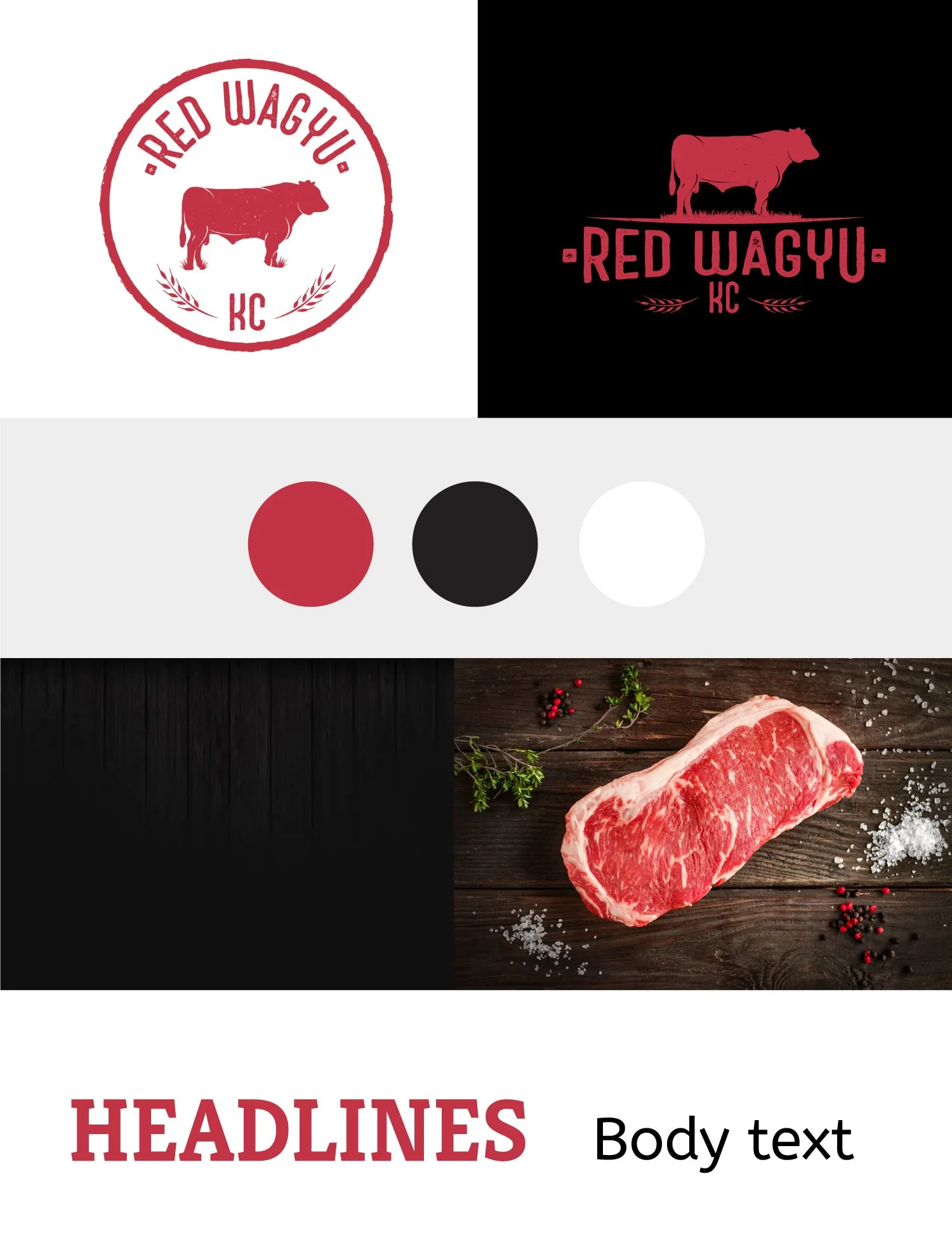
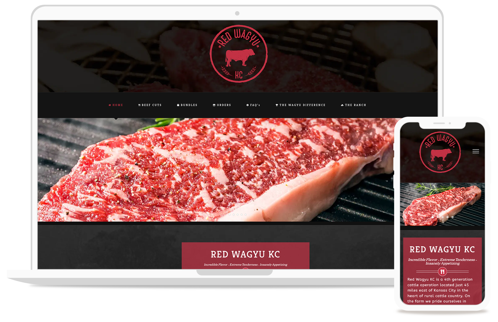
They approached us looking for a logo and website design. The website needed to show a portfolio of their beef cuts as well as the packages offered. We ended up using a red, black and white coloring scheme to reflect the Red Wagyu beef itself, as well as dark backgrounds to show luxury and represent a high end product. The logo itself was given a very midwestern look at feel; handmade and humble.
The end result was a very cohesive brand. An easily navigable website that showcases their meats and packages with a humble yet high-end midwestern look and feel.


